Tuesday, April 17, 2018

MAD magazine goes back 60 years
to tweak its logo

Mad magazine has unveiled a new logo and cheekily (for Mad there is no other way) labelled the issue No. 1. In fact, the decision loops back to the original 1952  logo by Harvey 
Kurtzman. Print magazine reproduced the chronology and evolution  of the much-loved satire magazine's logo (see below: click to enlarge)
Executive editor Bill Morrison said:
"We believe there are six things that are essential to MAD: the movie and TV parodies, “Spy vs Spy,” “A MAD Look At…(topic of the issue),” the Marginal Drawings, the Fold-In and, of course, Alfred E. Neuman. These are important to MADfans and will remain in the magazine. We felt that with these pillars of the magazine intact, MAD fans would be willing to accept a different look for the magazine. So far, we’ve been proven right."

Labels: , ,

Tuesday, January 27, 2015

Redpoint Media unveils new-look, new-name WestJet Magazine

WestJet is the new up!  The inflight magazine of WestJet, published by Calgary-based Redpoint Media, is unveiling a new look and a new name (WestJet Magazine) to replace its previous name up!, as well as a redesigned website. 
Associate Publisher Pritha Kalar says the redesign reflects the character of the brand. "It was essential to give WestJet guests the most seamless, inspiring, accessible experience possible, because that's what they've come to expect," says Kalar. "We're extremely proud of the new design, which is contemporary, highly visual and really expresses the passion and excitement of travel."
The January print issue in seatbacks features a curated list of the top 15 places to visit in 2015, as well as advice for dining in New York City from Anthony Bourdain. A digital issue is downloadable for Apple, Android or Kindle. 

Labels: , ,

Friday, July 04, 2014

Largest golf magazine in the world redesigned to appeal to younger audience. Will it work?

There has been a great reluctance to mess with specialty sports magazines for fear of scaring off the core audience. There seems to have been the assumption that the readers were older, set in their ways and resistant to change. Well, we shall see.

Golf magazines have seemed ossified, stuck in 1962 and featuring a round-robin of topics and cover lines so that readers may bask in the deja vu. Their own kind of handicap, so to speak.

Condé Nast decided to make over Golf Digest, the most widely read golf publication in the world and allowed their design team and Luke Hayman, a partner in the design house Pentagram, to go get them some of those millenial golfers. As the Pentagram site notes 
The format opens up the magazine for a looser, more playful feel that conveys the game’s athleticism and virtuosity, as well as the growing “cool” of golf culture, embodied by player-fans like Justin Timberlake and Jimmy Fallon. For the designers, part of the challenge was finding new methods to visually represent the subject—to break up the monotony of pictures of golf course greens against the bright blue sky, or to show golf tips like swing paths in an unexpected way.
To update the masthead, the designers looked for a font with balls—specifically, ball terminals, which add a playful touch given the subject matter. The contemporary stencil-like font Dala Moa was selected for its distinctive ball terminals, which break free from the letterforms so balls can be hidden in plain sight in the logotype and in display text. With the blessing of Dala Moa’s designer, Paul Barnes, the terminals were customized to make them perfectly round. Commercial Type, the foundry that licenses the font, worked on refining the logotype by adjusting the letter spacing as well as the spacing of the stenciling, to make sure the identity would work in a range of different sizes. The colored dot of the “i” in “Digest” was retained as a link to the magazine’s former logo. 
Inside, the tone is smart, sophisticated, and irreverent, with content designed to engage both golfers and non-golfers. About a quarter of the magazine continues to be instruction––tips and techniques––joined by more articles that contain data and stats about golfers, games and gear, both for pros and amateurs. Shorter articles offer more entry points for the reader, and a flexible grid gives the dense information room to breathe.
Pentagram is well known for its design generally, but its magazine work specifically, ranging from TIME to the New York Times magazine and Atlantic, from Vanity Fair to Billboard. 

Labels: , , ,

Tuesday, February 04, 2014

Jane Francisco, late of Chatelaine, wastes no time in putting stamp on Good Housekeeping

Jane Francisco has wasted no time in making her mark at Hearst's Good Housekeeping. According to a story in AdAge, the former editor-in-chief of Rogers flagship Chatelaine has already redesigned the look of the March issue of the magazine, the first with her name on the masthead. 

Her challenge is somehow to revitalize the 129-year-old magazine without cheesing off its 4.4 million existing subscribers and attracting newer, younger women readers who might not be expected to read a magazine with the word "Housekeeping" as part of its logo.
"I wanted someone who had an unexpected take, not someone who had potentially edited three of these magazines in the U.S. in the past," said David Carey, Hearst Magazines' president. "Jane has great instincts for transforming a legacy business and making it more modern." 
"Her mandate is not to turn the business upside down," he added. "But at the same time the role of all the women's lifestyle magazines that have a service component have to be constantly reexamined."
One example of hitting the ground running is that, in May, Good Housekeeping will  roll out its first All Star Beauty Awards, a biannual compilation of the best beauty products carrying the seal of the Good Housekeeping Research Institute.
"We target women who have a busy life," [said Franciso.] "We can deliver the one-stop shop if you can't make it through your shelter magazine or if you're interested in fashion trends you can use today."

Labels: ,

Sunday, January 26, 2014

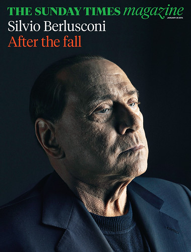
The Sunday Times magazine gets a makeover

"Bigger pictures -- less pictures, longer reads -- less bits."* 
Art director Matt Curtis, describing the complete redesign of The Sunday Times Magazine, the supplement to Britain's Sunday Times. The entire newspaper also received a makeover. 

 According to a post on Magculture.com, the wholly new look includes the new logo treatment in Tiempos (based on the classic Times New Roman by Stanley Morison) and Calibre, a new sans serif face created by Kris Sowersby. The Sunday Times magazine editor is Sarah Baxter and Jon Jones is director of photography.

Interesting to note that one of the three designers on the redesign team is Jessica Rose, the former art director of Toronto Life. 


*Minor quibble: Might this have been, correctly, fewer pictures and fewer bits? 

Labels: , ,

Thursday, January 16, 2014

Vancouver magazine unveils redesign

Vancouver magazine has unveiled a cover-to-cover redesign in its January/February issue now on newsstands. 
"We’ve all been at that stage in a relationship: you love each other but you can’t help think it wouldn’t kill your other half to hit the gym once in a while," said the magazine in a release. "With the freshly redesigned issue, Vancouver magazine has done more than attend the occasional yoga drop-in.  It has trained for a marathon.  
” 'Readers will be thrilled to see the sophisticated design and new content', said Lori Chalmers, Publisher of Vancouver magazine and Western Living. 'In particular, an increased focus on food and wine reflects our readers’ passion and interests, and affirms our position as the city’s premier consumer magazine.' ”
Food and drink coverage and the popular designing section has been moved forward. There is an inreased emphasis on food and wine and  nearly every page is signposted and the content is delivered in three sections: 
  • The Brief introduces more real estate coverage and takes on the month’s leading stories and story makers. Politics, sports, the arts, business — it’s a highly curated, unique, opinionated filter of the best (and the worst) the city has to offer.
  • The Dish covers Vancouver’s restaurants and bars, with added suggestions for nights at home (as one example, check out a lifesize King crab on pg. 36 of the January/February issue, with recipes.) Readers come to Vanmag for food—now the culinary section is even more enticing.
  • The Goods is a new section reporting on shopping, travel, health and fitness, and style.

Labels:

Wednesday, September 18, 2013

Canadian Health & Lifestyle retools look and content for October issue

The recently new editor of Canadian Health & Lifestyle magazine, Beth Thompson, is leading with a new look and new columnists effective with its the October edition.
The strategy behind the revamped pub is to make health and wellness more accessible to Canadians, says Thompson in a release. “We’ve added new experts, who answer readers’ questions on everything from diabetes to PMS to skincare. 
“As well, we’ve enhanced our beauty and wellness sections to be more service-based, offering lots of tips and product selections to help readers navigate the drugstore aisle.”

Rogers Publishing bought the magazine in April 2012. The magazine at that time had a largely controlled distribution of 397,000, about 230,000 of which were distributed free through the Katz Group Canada Ltd. in its Rexall group of pharmacies  including Rexall, PharmaPlus, Guardian, IDA and The Medicine Shoppe. All carry the Rexall logo. 

According to the Spring 2013 PMB results, CH&L is the #1 health and lifestyle magazine in Canada with a total readership of over 2 million. In addition to its controlled circ, it is also available as an app on iTunes.

Labels: ,

Wednesday, September 04, 2013

Western Living unveils redesigned, bumper Designer of the Year issue

Western Living magazine is unveiling a refreshed, new look with its September issue which highlights the winner of its annual Designers of the Year competition. It is the largest issue in more than 20 years. 

The magazine is a lynchpin of western Canadian publishing and the western flagship of its parent company, TC Media, and has a total of 587,000 readers according to the spring 2013 PMB. 

This year, the Designers of the Year event will be held on Thursday, September 12th in Vancouver and on Wednesday, October 2nd in Calgary. It celebrates the best new designs in Western Canada, as judged by Canada's foremost designers and architects. In partnership with IDSwest, the magazine is hosting its first-ever Western Living Design Week, to be held from September 12 to 22. 

It's all but inevitable that when a new art director takes over a visual redesign can't be far behind, though a lot of the structural, editorial changes in the magazine have been driven by editor-in-chief Anicka Quin. Paul Roelofs returned to be the art director of both Western Living and Vancouver magazines last December after a time in the U.S. He had been AD of Western Living from 1988 to 1993 before working on Garden Design magazine and Saveur.He then joined Time Inc.'s launch of InStyle magazine as creative director from 1995 to 2005, during which time he also handled various spinoffs: InStyle Weddings, InStyle Home, InStyle The Look and InStyle Makeover.

Labels: ,

Monday, July 22, 2013

Canadian Living refreshes its look, logo
and content

New look
Canadian Living magazine will be unveiling a new look -- what it calls as "refresh" -- with its September issue, which will be on newsstands August 5. The magazine will have a new logo, extensive content updates and will be polybagged with a special 32-page supplement aimed at mothers called Canadian Living Moms (which has the earmarks of a test run for a line extension or spinoff). 

The September issue will also have four sequential covers each emphasizing the main editorial pillars of the magazine -- food, style, health and home. The new look will be carried through all the platforms that Transcontinental Media offers, including the website, mobile and social media. The relaunch issue will be selling at a special price of $2.99 on newsstands. 
Old look
“Over the last several months, we reached out to thousands of Canadians, both current readers and non-readers to find out what they wanted more of, less of and what topics were on their minds,” said vice president and group publisher, consumer solutions, Toronto and Vancouver, Caroline Andrews. “Their feedback inspired us to bring a fresh new perspective to every aspect of the brand. I am confident our long-standing readers will continue to find everything they've always loved about Canadian Living, and new readers will be impressed with the evolution of this beloved Canadian brand."

Read more »

Labels: ,

Monday, May 27, 2013

Metro undergoes redesign to accommodate
lost inch

New look
Old look


Metro, the weekday freepaper with city editions across Canada, has undergone a redesign of its front page and some inside sections. (It was necessitated by a recent slimming of the paper's trim size.) The redesign was carried out by K9 Design, known for its work on a number of magazines such as Alternatives Journal and East Coast Living. 

K9's creative director Norm Lourenco explained that they moved the masthead to the very top of the page and made the logo bigger, getting rid of the sky bar. The keys were moved directly below the masthead and new elements added like like a “web-call-out” and social media cues to help drive readers to the web site.

Metro Canada editor-in-chief Charlotte Empey (one-time editor of Canadian Living magazine) said
When we changed the web width of our paper, we needed a compelling new front page design that would compensate for the inch of editorial space we lost – and contribute to increased pick up and pass along rate." 

Labels:

Tuesday, October 09, 2012

Coup de Pouce unveils redesign --
"la vie, en plus facile"

Coup de Pouce, the French-language equivalent of Canadian Living magazine has undergone a front-to-back redesign, as has its website and mobile presence. 
TC Media,the publisher, says that the Coup de Pouce readership has not only grown in the past several years, but research done by CROP and Ad hoc recherche has shown that reader behaviour has changed, as has what resonates with Quebec women who form the vast majority of the magazine's audience.
Coup de Pouce, has more than 1.1 million readers and 317,000 unique visitors to its site each month. The November issue unveils the redesign and is being sold at a discounted price of $1.99.
Lise Paul-Hus, Publisher and Vice President, Consumer Solutions, Montreal said in a release:
"The steady growth in the Coup de pouce readership over the past several years testifies to the brand's ability to reflect readers' interests and stay in tune with their fast-changing world. To keep this forward momentum, the brand has been completely revamped and we are proud to unveil the results of our work today."
The magazine has a new tag line "la vie, en plus facile", improved fashion and beauty sections, a kitchen section, a more design-oriented home decor section and new columnists, including actor Catherine Trudeau (Besoin d'air) and journalist Diane Bérard (Besoin d'aide).
"Excited and nervous both, that's how I feel after months of working on revamping a magazine that already has a dedicated readership," said Sylvie Poirier, Interim Chief Editor and Director of Multi-Brand Content.

Labels:

Thursday, July 26, 2012

Alternatives hires K9 Design and Coverssell to boost its look and audience

February 2012
Alternatives Journal is clearly intent on expanding its reach. While the environmental magazine has a strong niche following, it has struggled to reach the wider public. It has now retained K9 design to renovate and redesign the magazine and Scott Bullock of Coverssell.com to create a newsstand strategy and manage circulation. In a release on the K9 website, Marcia Ruby, the publisher and creative director of Alternatives, which is published 6 times a year out of Waterloo, says
"Now is the time that Alternatives must facilitate the voice of environment louder than ever, so this redesign is also the most critical to the future of our 41-year-old magazine. Alternatives began in the fledgling years of the environment movement, when Environment Canada, Greenpeace, World Wildlife Fund and loads of other like-minded organizations began taking shape."
As one of the reasons for retaining them, Ruby points to the positive impact that a K9 redesign had for East Coast Living, boosting advertising and newsstand sales after the magazine won the redesign in a national competition. 
"The redesign process will not only produce a new aesthetic cover-to-cover, we will pull apart every nook and cranny to reveal all the areas that need to be overhauled," says the K9 release. "Editorial, circulation strategy and launch are all under scrutiny."

Labels: ,

Monday, July 16, 2012

Weddingbells magazine does a front-to-back, lighter, airier redesign

Weddingbells magazine, with its Fall & Winter 2012 issue on the newsstands today, has a new, lighter, brighter look, the result of a front-to-back redesign. 
The cover reflects the redesign with a soft colour scheme and light, airy feel to better highlight the image. The issue features Lisa Ray, a Top Chef Canada host, on love, marriage and her upcoming destination wedding; Real Weddings – inspirational celebrations from couples across Canada; From peplum to colour: the hottest new trends for bridal gowns; and Cakes and flowers in an all white colour palette
Weddingbells is published twice a year by St. Joseph Media and recently launched its first-ever special interest publication called Weddings, which is clearly intended to become an annual. 

Labels: , ,

Wednesday, May 23, 2012

Ontario Bar Association unveils its new
magazine JUST.

The Ontario Bar Association has unveiled a virtually new publication called JUST. for lawyers in Ontario. The six-times-a year magazine (tagline: "For people with a calling") was unveiled Wednesday night at a reception at the Trump International Hotel on Bay Street in Toronto.

The OBA has been producing a house-organ style publication Briefly Speaking for its members for 33 years and since 2006 it has been a magazine. But based on readership research it has repositioned and completely redesigned it to provide a balance of industry and lifestyle content. The relaunch process has been directed by editor Catherine Brennan and the rebranding and new design was done with the assistance of Espresso Inc. The art director is Janet Weldon. Part of the magazine's content is written mostly by practitioners and is bilingual, French and English; in French, the magazine is called JUSTE.
"JUST. is the only legal magazine that specifically targets Ontario lawyers," said a release. "As the voice of Ontario's legal profession, the OBA draws upon the diverse expertise of its membership to provide content that is interesting and relevant.
"We talk to our readers as people, not just lawyers, and get that there's more to the industry than the everyday workday. We are enlightened, engaging and relevant, committed to being the only magazine for all things legal in Ontario."
The print edition has a controlled distribution of 18,000 including 17,000 lawyers, judges and law students across Ontario who are OBA member. A digital edition is available at JUSTMAG.ca, and through a mobile application; the publication will be available as a tablet edition in June for Apple and Android devices.
A one-time, full-page ad in the magazine is $3,025.

Labels: ,

Thursday, March 22, 2012

VIA Destinations magazine gets a makeover

VIA Rail Canada's onboard magazine VIA Destinations! has undergone a redesign. The six-times-a-year, wholly bilingual title is contract-published by Éditions Gesca and circulates 60,000 controlled copies on the trains and in VIA first class lounges. 
The change to the magazine complements changes and investments that the passenger rail company is making to its services and facilities. Editor- in-chief Luc Boulanger said in a release
“We have reworked the graphics grid under the direction of Benoit Martin who, among other things, is the artistic director of M and XY magazines, so as to allocate more space for graphic elements, which gives the publication a far more compelling personality. We’ve also streamlined the information management to make the magazine more enjoyable to read.”
The Women's Issue features 10 Canadian women who are models in their professional field, including comedian and host Véronique Cloutier,  Bonnie Brooks, President and CEO of the Hudson's Bay Company; and CBC reporter Amanda Lang.
Digital edition.

Labels:

Tuesday, January 03, 2012

Alberta Venture launches new look and feel for 15th anniversary

To celebrate its 15th anniversary, Alberta Venture magazine has unveiled a top-to-bottom redesign.
When publisher Ruth Kelly bought the name and the mailing list and one issue’s worth of paper stock from the provincial government for $100 in 1996, the economic development department had been publishing it as a quarterly broadsheet for 13 years. Kelly relaunched it as a 10-issue-a-year business magazine in April 1997. 
The visual "refresh" -- everything from the logo, which emphasizes the word "venture" to the colour palette -- was led by art director Kim Larson. She says
“It’s not just one idea. Everything has to interlink and make sense. You have to really think. It is massive. It’s been an intense four months.”
Editor Mike Ganley, who started less than a year ago, made a number of changes, reviewing every element and created a new emphasis in the  front-of-the-book segment. It's now called The Briefing:
 “We did away with what we had been doing, typically a series of mini-profiles on people and businesses, to a much more energetic, short, newsy section.”
The magazine's back page will now feature a new column, written by well-known Alberta writer Myrna Kostash. A Q&A section has been added with investing questios answered by Fabrice Taylor and the industry report section has also been given a stronger identity. 
That’s something that has set the magazine apart, Kelly says, and will continue to going forward. “We are the only business magazine in Canada that looks at a specific industry in each and every issue. This is something I’ve created from the beginning and I’ve stuck with it because it’s something that differentiates us.”
The magazine's website (which will unveil its companion remake next month) carries an online account of the process behind the new look and content. 
Kelly says the redesign is about more than looks or tinkering with editorial mix:
“While the anniversary is a great reason to do it, every good magazine should go through a self-examination and understand the changing patterns in its readership on a regular basis. I think one of the things we’re doing with this print edition is we have considered the importance of the movement from a print product to a digital publication – moving from fibre paper to pixel paper.”
A digital copy of the new-look magazine is available.

Labels:

Monday, November 28, 2011

Visual makeover of print and web credited with big growth at East Coast Living

A visual makeover of East Coast Living magazine and its companion website have paid off big time, according to a release from the magazine, which won the 2010 Makeover Contest sponsored by K9 Design, a leading Canadian design firm in Toronto.
The new logo, cover and interior layout for the quarterly homes and lifestyle title seems to have strengthened ad revenues, which have grown by 20 per cent since 2009.
Winter 2009 (before)
“East Coast Living now has a stronger look and feel and our new contemporary design is catering to our core group of readers but also to younger, urban readers, which is very exciting,” says publisher Patty Baxter.
National advertising grew from 15 per cent in 2009 to 27 per cent in 2011. Traffic on East Coast Living’s website, redesigned by Halifax design firm Kula Partners last year in conjunction with the makeover, has doubled, with a 232 per cent increase in unique visitors and a 214 per cent increase in total visits.
Winter 2011 (after)
Norm Lourenco, founder and creative director at K9 Design, is amazed with the results. “For East Coast Living to have accomplished this level of success proves that when you have the right message married with the correct visual language, it creates a powerful product,” he says.

Labels:

Thursday, May 12, 2011

Canadian Family redesigns and relaunches its parenting website

CanadianFamily.ca
Canadian Family magazine (St Joseph Media) has rebuilt its website CanadianFamily.ca to reflect changes they have seen in online parenting information sites since the site was launched in 2006. One of the most obvious improvements was sections tabbed by age and stage so visitors can quickly find information most relevant to their situation.
The centerpiece is the new recipe-finding tool, a much-needed improvement to the content most important to our audience," says executive producer Chris Skinner. "We’re also growing our team for the first time with two new editors hired in the past month: Ali Martell (formerly of Urbanmoms.ca) has joined us as senior associate editor, and Alicia McAuley (formerly of BestHealthmag.ca) is our associate editor. They will work with Megan McChesney, our executive editor and senior producer as we kick off a rejuvenated content strategy with more original content rolling out in the coming months.
The relaunch will be followed by development of improved newsletters and communities, social media integration and various new tools.

Labels: , ,

Friday, February 25, 2011

Momentum, the Vancouver-based cycling magazine, unveils new look and new tagline

Momentum, the Vancouver-based cycling magazine with North American ambitions, has unveiled its new look at the North American Handmade Bicycle Show in Austin Texas. With the new logotype, downplaying the name in favour of an iconic 'MO', comes a new tagline. Formerly it was "The magazine for self-propelled people". Now it is "Smart living by bike". Showing off the new logo and tagline are director of marketing and advertising Mia Kohout and Jim Nissen of  Austin-based Switch Studio, now handling design . Below is the old look and logo.
The magazine is distributed in 20 North American cities and has a press run of 30,000 copies.

Labels: ,

Tuesday, February 08, 2011

Torstar's Eye Weekly to be given a whole new look (and a whole new name?)

Big changes are afoot at Toronto's Eye Weekly (published by Torstar), including a complete redesign of the print magazine and the website, perhaps topped by a new name. 
According to a story in Marketing magazine [no longer available online], the dramatic overhaul will be trumpeted by a multi-media advertising campaign devised by the hip agency Rethink Toronto.
The publisher and editor-in-chief of Eye, Laas Turnbull, who has already put 10,000 volts through the newsprint weekly and given it a real citymag vibe, with hard-hitting journalism and bracing cover treatments, says the paper is going to shift away from the heavy emphasis on arts and entertainment. (This would provide a differentiation for Eye from its older, heftier rival NOW magazine.)
"We want to be a city magazine for 20- and 30-somethings in Toronto," [says Turnbull]. "Everything is kind of up for review right now. We’re looking at every part of the business and every part of the brand–what needs to go, what needs to stay and what needs to change....”
Rethink Toronto's Pema Hagen says that the print, television and online creative will draw people to a new Eye experience:
“The changes are going to be drastic and I think the paper that is going to be launched at the end of the day is going to be something that Torontonians are going to love, and something that’s going to be very different from what’s currently out there."

Labels: , ,