Tuesday, February 20, 2018

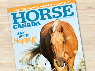
Horse Canada magazine unveils an updated logo

Horse Canada magazine, published by the Horse Media Group, has unveiled a new masthead, its first redesign since 2001. The new design was done by Bonnie Summerfeldt. 

The mandate was that It needed to be easily read at a distance, attractive to adults and children, and also show it's authority as a trusted source of equine health info.

Labels: ,

Monday, November 07, 2016

Magawards unveils 40th anniversary logo

The National Magazine Awards Foundation has unveiled a new logo that will grace all of the creative, including event materials and the gala program, marking the organization's 40th anniversary. It was done by Studio Wyse and art director Vanessa Wyse, herself a frequent nominee for the Magawards with 5 gold and 2 silver medals since 2004; in 2012, she won triple gold hat trick for art direction of an entire issue, art direction of a single article and best magazine cover. 

Wyse said this of the new logo:
"For this years visual direction we went back through the archives and took design cues from when the NMAs were established in 1977. We couldn’t resist the fun, colourful and quirky nature of magazines in this era. We built the design around Philip Kelly’s font, Pump, drawn for Letraset around this time, which had the perfect amount of character and sophistication for this special anniversary.”

Labels: ,

Wednesday, February 17, 2016

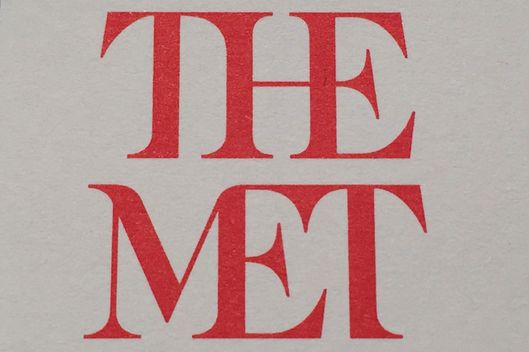
Block that ligature: Will New York take to the new Met museum logo?

The new look...
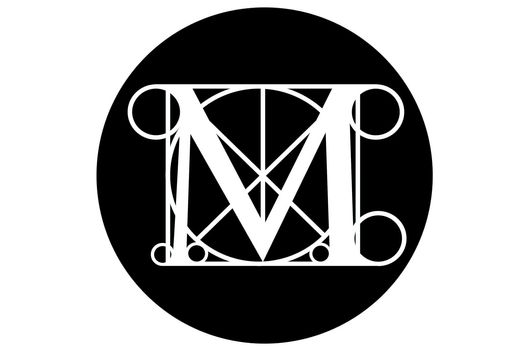
...and what it's replacing
Block that ligature. The redesign of an institution's identity isn't an easy matter, but often it's simply agreeing to disagree. However, the look of New York's Metropolitan Museum of Art is likely to get a lot of criticism. 

People have had 45 years to get used to the current logo with its stylized M. The new one, with its squnched-up type, overbearing "The" and aggressive axe-head serifs will take a lot of getting used to, if ever. It will be reflected and seen everywhere in a complete makeover of maps and signage, starting \March 1. 

The redesign was done by the London-based international branding firm Wolff Olins, the firm which did over the typographic look of the Tates -- Britain, Modern, Liverpool, St. Ives.

Labels: ,

Wednesday, May 30, 2007

Name my magazine, please

York International, a division of York University is holding a competition to give a name to a new online magazine about post-secondary international education in Canada.
"Unique in Canada, the magazine will act as an open space for dialogue, discussion and debate on the practices and policies, challenges and opportunities for internationalization at the postsecondary level in Canada", says a release.
It's to be published three times a year and will be subtitled: The Canadian Magazine of International Education. The prize (besides the glory): a $100 gift certificate at the York University bookstore. The contest is open to "all members of the York community", so presumably that includes all alumni.

Labels:

Thursday, April 05, 2007

Smashing idea -- an international
logo design contest

Wow, there's a lot of good and interesting work going on out there. Smashing Magazine, a very interesting web publication out of Saarbrucken, Germany, that started just last August, held a competition for a new logo for its site. And in just three weeks, the ideas just poured in, from all around the globe. One of the finalists (the winner is to be announced tomorrow) is by someone from Canada (shown, above). Many of the finalists are from eastern Europe. And if you ever needed to see how a creative brief can be interpreted umpteen different ways, this competition is an example.

[UPDATE: the winner (below) was from South Africa. You can see the five finalists here, too.

Labels: , ,