Wednesday, December 13, 2017

Purple (erm...ultra violet) is the Pantone colour of the year

Pantone's 2018 Colour of the Year is ultra violet, which it describes as “provocative and thoughtful,” noting it “communicates originality, ingenuity, and visionary thinking that points us towards the future."

The annual unveiling of the COY is part-promotion, part conversation-starter. The formal name of the colour on the chip is 18-3838-Ultra-Violet .

Ultra Violet is “multi-faceted,” says Leatrice Eiseman, executive director of the Pantone Color Institute and author of numerous color books, including most recently The Complete Color Harmony, Pantone Edition. “It’s a little complicated, which we feel is one of [the color’s] appeals. It’s not easy, not chili pepper red and all hot and dancy.” It’s this complexity that Eiseman believes will attract designers to the color: “Designers invariably get purples,” she says. “You talk to people on the street, though, and they’re more skeptical. That’s why we think designers will like it: you do have to have a conversation about” Ultra Violet and its uses.

Labels: ,

Monday, November 07, 2016

Magawards unveils 40th anniversary logo

The National Magazine Awards Foundation has unveiled a new logo that will grace all of the creative, including event materials and the gala program, marking the organization's 40th anniversary. It was done by Studio Wyse and art director Vanessa Wyse, herself a frequent nominee for the Magawards with 5 gold and 2 silver medals since 2004; in 2012, she won triple gold hat trick for art direction of an entire issue, art direction of a single article and best magazine cover. 

Wyse said this of the new logo:
"For this years visual direction we went back through the archives and took design cues from when the NMAs were established in 1977. We couldn’t resist the fun, colourful and quirky nature of magazines in this era. We built the design around Philip Kelly’s font, Pump, drawn for Letraset around this time, which had the perfect amount of character and sophistication for this special anniversary.”

Labels: ,

Wednesday, February 17, 2016

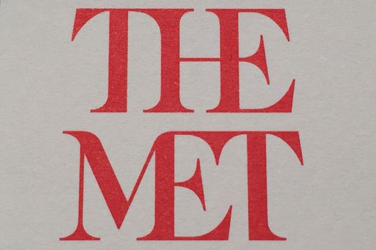
Block that ligature: Will New York take to the new Met museum logo?

The new look...
...and what it's replacing
Block that ligature. The redesign of an institution's identity isn't an easy matter, but often it's simply agreeing to disagree. However, the look of New York's Metropolitan Museum of Art is likely to get a lot of criticism. 

People have had 45 years to get used to the current logo with its stylized M. The new one, with its squnched-up type, overbearing "The" and aggressive axe-head serifs will take a lot of getting used to, if ever. It will be reflected and seen everywhere in a complete makeover of maps and signage, starting \March 1. 

The redesign was done by the London-based international branding firm Wolff Olins, the firm which did over the typographic look of the Tates -- Britain, Modern, Liverpool, St. Ives.

Labels: ,

Friday, October 30, 2015

Applied Arts founder Georges Haroutiun honoured by scholarships

To mark its 30th anniversary of publication and in honour of its founder, Applied Arts magazine has launched the Georges Haroutiun Scholarship. Three $3,000 scholarships will be awarded in April 2016 in the areas of Advertising, Design and Image. Students must complete an assignment and submit it digitally. 
"Georges has always been a champion of young talent, stressing the important role youth play in energizing the creative community," said an announcement. "Thus Applied Arts has consistently recognized, supported and celebrated the work of students, particularly through the Applied Arts Student Awards program. 
"In recognition of Georges Haroutiun’s contributions to the design industry, his legacy and his mentorship of students, — whether as art director of Applied Arts, in his days teaching at OCAD University, or now, in his “retirement” consulting on the magazine’s initiatives — we are thrilled to present these new scholarships in his honour."
Further info

Labels: , ,

Tuesday, August 25, 2015

Western Living magazine unveiling redesign in a wider format

Western Living magazine has been completely redesigned: taking on a streamlined and refined  new logotype as WL, in a somewhat larger format. Readers will see the new look imminently as part of September's annual Designers of the Year issue. on newsstands and in subscribers mail slots at any moment. Concurrent with the redesign is a revamped website and responsive mobile website design. The inch-wider format gives the design more elbow room for its usual lavish photography and takes advantage of what print does so well. 

Editor-in-chief Anicka Quin, art director Paul Roelofs and publisher Tom Gierasimczuk talk about the redesign in the following video.

Western Living is under new ownership, as part of the Yellow Pages group in BC, along with sibling Vancouver magazine, although doubtless the redesign has been in the works for some time before that.

Labels: , ,

Tuesday, February 17, 2015

Canada's History magazine undergoing a "refreshment" of design and presentation

Feature opening
Canada's History magazine is undergoing a refreshment of its design which will be unveiled with its April-May issue, now at the printers. The magazine will be marking its 95th birthday this year.
While the redesign pretty much leaves the cover architecture and logo alone (so as not to jeopardize the gains the magazine has made on the newsstand), the inside pages and the front and back of the book have been substantially modified by the editorial team, looking to reflect the contemporary relevance of history. 

The visual redesign was handled in house by art director James Gillespie, working with consultant Karen Simpson. The new look includes new fonts and font sizes to improve readability. Editor-in-chief Mark Reid says of it
"Both the front and back of book sections have been streamlined. The Currents section is now more visually dynamic, and some regularly recurring items — such as "Brush Strokes" — have been re-imagined for a modern audience. Our former Reviews Section is now titled Books, and will feature not only book reviews but also interviews with authors, book excerpts and other items of interest to readers. 
Column
"The features section also received a makeover, and now employs a tasteful design that showcases — rather than competes with — the words, pictures and paintings. Layouts are cleaner thanks to the creative use of white space. 
"As many readers know, Canada's History used to be called The Beaver, and we have not forgotten our historic connection to that iconic publication, or the Hudson's Bay Company, which launched the magazine in 1920 as an internal newsletter. In Canada's History you will find many nods to our past; we’ve retained our Trading Post column that showcases fur trade-era artifacts; every feature article ends with a small beaver icon; and we’ve renamed the Letters page “The Packet,” as it was called back in 1920 when the magazine was launched.
Currents opening

Labels: , , ,

Monday, February 02, 2015

Former Toronto Life art director Jessica Rose is moving to Tatler magazine

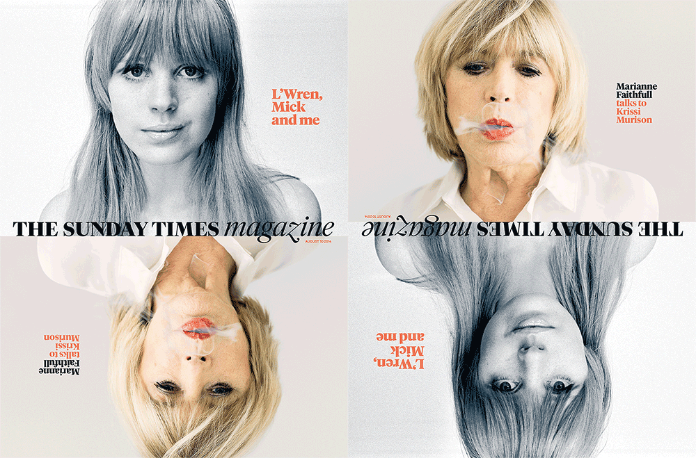
The former art director of Toronto Life, Jessica Rose, has been working for some time at The Sunday Times magazine in London (at right is one of her recent covers.)

Now, she's moving to be the new art director of the high society and fashion magazine Tatler, published by Condé Nast Publications (see below).

She reports that one of the biggest pleasures at the ST was doing a series of front-of-the-book columns with Matt Rudd called the "God of Small Things". There's an archive of them on her website. 

Labels: , ,

Tuesday, July 29, 2014

Mixing a bit more fun with authority, Ski Canada's new look unveiled

Ski Canada magazine is unveiling a whole new look starting with its 2015 Buyer's Guide. The redesign, including a new swooping serif logo, is done by the magazine's designers for the past 8 years, K9 Strategy and Design. 

Partner Jennifer Lourenco says the goal is to strengthen the 42-year-old brand as a current, authoritative voice on all things ski.
"Every redesign is a balancing act between yet-to-be-realised new readers and current loyal readers – you’re constantly asking have we gone too far, or not far enough," she said. "For Ski Canada, we’ve introduced elements that will bring a bit more fun to the reading experience, while still maintaining their role as the leading publication that is synonymous with skiing.”

Labels: ,

Monday, April 07, 2014

Facing the future with the Sheridan graduate illustration show opening April 10

The annual Sheridan Illustration graduate show is on this Thursday, April 10 at 7 p.m. (continuing through Friday 2 - 9) at 99 Sudbury Street, Toronto. "New Faces"is a great place for magazine people to see some of the brightest new talent coming up and into the business. Sheridan College offers the only dedicated Bachelor of Arts Illustration degree program in Canada and the grad show culminates 4 years of study. 

Labels: , ,

Tuesday, March 18, 2014

Prefix Photo an editorial finalist in Redgee Awards


The finalists for the Redgee Awards have been announced and among those are included editorial work from Toronto-based Underline Studio's work on Prefix Photo magazine, issues 27 and 28. 
The Redgee Awards are run by Designedge magazine (C. J. Oyster Publishing Inc.) and they divide the country into eight regions representing the best of local Canadian design. Designers compete within their own geographic region in up to 14 print and digital categories, including editorial. Best in region, honourable mention and regional category winners will be announced on Monday, April 28 at the Berkeley Church in Toronto. Tickets are $25.

Labels: , ,

Monday, March 17, 2014

Future palettes to influence design and
taste-making

For shelter and lifestyle publishers, editors and art directors out there, Pantone the colour experts have published a series of palettes that contain 72 forecasted colours which they say will inspire and influence home furnishings, design and other aspects of taste-making in 2015. According to a post on Dexigner, Pantone View Home + Interiors 2015 provides colour swatches and images for use in their work. The palettes go by names such as Style-Setting, Abstractions, Botanicum, Zensations, Urban Jungle, Tinted Medley, Past Traces, Serendipity and Spontaneity. (That's Style-Setting up there, ranging from Champagne Beige to Steel Gray; it is said to be all about poise, fitness and polish.)

Labels: , ,

Monday, February 24, 2014

Best Canadian magazine newsstand covers
to be announced today

The Canadian Cover Awards/Grands prix canadiens-Meilleures couvetures are to be presented Tuesday at the Courtyard Toronto at 6 p.m. Along with the various category winners, this year's Newsstand Marketer of the Year will be named, an individual who demonstrates true innovation in a successful newsstand marketing project. The awards are a joint production of Magazines Canada and the Circulation Management Association of Canada. Sponsors are reception sponsor Alliance for Audited Media, promotional retail sponsor Gateway Newsstands, marketing sponsor Covers Sell and design sponsor K9 Design Co.

Finalists for the awards are after the jump:
Read more »

Labels: , ,

Wednesday, February 19, 2014

The Grid magazine named -- again -- one of five best-designed newspapers in the world

The Grid, the weekly magazine published by Torstar Corp., has been named by the Society for News Design as one of the five best-designed newspapers in the world, for the third year running. (This will doubtless continue to annoy those critics who demand that The Grid choose whether it is a newspaper or a magazine rather than saying it is both.)

The judges said
"If The Grid were a friend — and it seems like it’s aiming to be – it would be the one who grabs this and that from their closet, adds a colorful scarf and a thrift shop bracelet to create a near perfect effect. 
"Pleasingly jumbled at first glance, the whole look is deceivingly harmonious and smart, supported by a design grid that might be 7 columns, 5 columns or somewhere in between, but is always in the neighborhood of hip."

Labels: , ,

Sunday, January 26, 2014

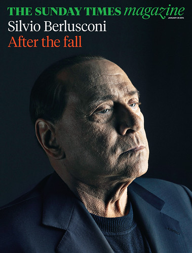
The Sunday Times magazine gets a makeover

"Bigger pictures -- less pictures, longer reads -- less bits."* 
Art director Matt Curtis, describing the complete redesign of The Sunday Times Magazine, the supplement to Britain's Sunday Times. The entire newspaper also received a makeover

 According to a post on Magculture.com, the wholly new look includes the new logo treatment in Tiempos (based on the classic Times New Roman by Stanley Morison) and Calibre, a new sans serif face created by Kris Sowersby. The Sunday Times magazine editor is Sarah Baxter and Jon Jones is director of photography.

Interesting to note that one of the three designers on the redesign team is Jessica Rose, the former art director of Toronto Life


*Minor quibble: Might this have been, correctly, fewer pictures and fewer bits? 

Labels: , ,

Thursday, November 14, 2013

Ink on paper is in renaissance, says
editor of Wallpaper*

Magazine publishers are among the people being featured in a new series of short films by an international paper manufacturer talking about what paper means to their companies. A new film will be launched every month by UPM Paper Europe and North America website. The first film in the Talking Heads series features Wallpaper* magazine editor Tony Chambers. He says, among other things
“I’ve noticed much more interest in how you use paper and how you use ink on paper, and experimenting with getting more from it. Because if you’re going to invest in putting your content into paper, then you need to make the most of it and I think there’s a real renaissance now in how content is delivered on paper.” 

Labels: ,

Tuesday, July 23, 2013

Design Edge Canada magazine now owned and operated by C.J. Oyster Publishing

Design Edge Canada magazine has been sold to the C.J. Group of Companies  and its  C.J. Oyster Publishing Inc. division in Toronto. 
The magazine was started in 2006 by North Island Publishing Limited of Mississauga, which also publishes the online magazine Masthead. According to a post on the magazine's website, the takeover brings with it the revival of the Canadian Regional Design Awards, which North Island had started but which were in hiatus.
"The paperwork was completed in May and the transition has been gradual, but as of last week The C.J. Group of Companies in Toronto is proud to announce we have completed taking over of the Design Edge Canada media brand, including Design Edge Canada magazine, designedgecanada.com as well as the Canadian Regional Design Awards (a.k.a. “the Redgees").... 
"We are very excited about taking on this publication and its affiliated properties,” says Jay Mandarino, founder and CEO of The C.J. Group of Companies. “It’s important to us that this publication flourishes and continues its mandate to inform and inspire graphic designers, art directors, creative directors and all other professionals associated with design in its many forms across Canada.”
Leslie Smith will be the publisher, replacing Doug Bennet, the founding publisher. She said that the redesigned magazine will be unveiled in September and the  hope was to revive the Design Awards in early 2014.

Labels: , ,

Wednesday, July 10, 2013

San Francisco countercultural posters featured in Massachusetts gallery

Martha and the Vandellas, 1967,
 by Bonnie MacLean
Tangential, at best, to the subject of magazines, nevertheless it's interesting (courtesy of a Facebook post by Rona Maynard, the former editor of Chatelaine) to see that the psychedelic posters of the '60s are making a gallery appearance.
Summer of Love is at Smith College Museum of Art in Northampton, Mass. (about as far as one might get from the home of the artform, San Francisco). 
The psychedelic aesthetic, which features bright, often clashing colors, freely drawn lettering styles, and dream-like imagery, was meant to mimic and capture the visual experience of mind-altering drugs. 
During the 1960s poster art underwent a radical transformation, emerging as an important means of communication. The time period saw a crucial shift from the mass-produced poster as an advertising vehicle to an art form whose goal was to spark social and political change. 
Psychedelic posters served as a kind of visual social media of their time, attracting and linking their main audience: young people in San Francisco. At the same time—with their provocative imagery and messages, inventive typography, and distinctive palette—the posters gained attention far beyond San Francisco where they were first posted or distributed.
This kind of wild and crazy artwork found its way into many magazines in the '60s and had a profound impact on art directors and designers of the time. 

The exhibition guide (pdf).  

Labels: , ,

Wednesday, May 15, 2013

Iconic art director Roger Black leaving U.S. for Hong Kong

Roger Black is one of the best known, bigtime art directors. His name has been associated with the best known brands in the magazine business; their design and redesign. Apparently, while opportunity continues to knock for his ambitious style, it doesn't knock so much anymore in North America. 

According to a story in Adweek, Black has announced he is moving to Hong Kong to work for a Swiss publisher Edipresse, which produces high-end society magazines.
Perhaps the most prolific of his kind, Black made his reputation working on publications like Rolling Stone, Esquire and The New York Times Magazine, but also titles like Reader's Digest and the National Enquirer. He embraced digital technology, working on sites like MSNBC.com and Bloomberg.com and helping create a digital publishing platform, Treesaver. In 2012, he received a lifetime achievement award from the Society for News Design. 
Yet the U.S. print industry declined, and with it, the money for Roger Black redesigns. Black gave up his gracious New York apartment. "The old studio ideas of going around the U.S. and designing newspapers and magazines is not a good business anymore," said Black (who's as upbeat as ever, even when he’s talking about how grim the magazine business has become). "I’ve had this a lot—'Let’s get Roger!’" Black paused for effect. "‘He’s so expensive.’"
In a New York magazine profile of Black, cited when he received the SND lifetime award, writer Michael Wolff said
“We (the general reader) expect magazines to look the way Roger makes them look. Roger has created a standard. … A Roger design helps you deal with your insecurities. Roger moves you to where you want to be. At the front of a newsstand. At a power lunch. At the heart of pop culture.”

Labels: ,

Saturday, February 16, 2013

Former Toronto Life art director Jessica Rose creates cover for British Sunday Times mag

Artwork by Jessica Rose, who was the art director of Toronto Life from 2008 to 2011, is featured on the cover of the February 17 issue of the Sunday Times Magazine, published in London. Rose, who moved to Britain following Toronto Life, is working on a graduate degree and freelancing as an art director and designer. 

Among her projects were the ELLE Collections and helping develop a new section  for the Sunday Times Magazine as well as working for art magazines such as MONACO and Misery Connoisseur. She is also about to launch an artist's project in the form of a magazine. 

Labels: , ,

Monday, October 01, 2012

Society of Graphic Designers of Canada to help Australian counterpart develop certification

The Society of Graphic Designers of Canada (GDC) and the Australian Graphic Design Association (AGDA) have signed a memorandum of understanding to develop and implement a certification program for graphic designers in Australia. 

GDC has been working towards comprehensive certification for design professionals, educators and administrators since 1956 and, through their program licenses the use of the unique CGD certification mark to members indicating they meet rigorous, standardized criteria. The organization has nine chapters across Canada. The AGDA has over 2,500 student, graduate, associate and professional members for whom it is currently developing a national certification system. 

Labels: , ,