Tuesday, April 17, 2018

National Geographic launches redesign

National Geographic, the 130-year-old  U.S.-based magazine that everyone seems to think they know, has unveiled a wholly new design, according to a story in Media Post. 
It retains the well-known yellow-margined cover but also several new sections, anchored in the front of the magazine:“Proof,” a section dedicated to short photo essays that bring new perspectives to the magazine’s audience; “Embark,” an investigative section filled with ideas and opinions meant to challenge reader expectations; and “Explore,” which will include a segment called "Atlas," a story told through maps, and an essay about a single, significant photograph called "Through the Lens."
Features are  treated differently, too (this month, the cover feature is about Picasso).
Rather than running four or five stories of the same length and depth of reporting, issues now feature two stories of traditional length and several shorter stories with a focus on illustrations and photos for storytelling effect. A “marquee” package will also continue to be published in each issue. 
The redesign also highlights two new paper stocks, meant to allow the magazine’s photography to appear richer giving the magazine a more substantial feel to its pages, and two new fonts, Earle and Marden, named after National Geographicexplorer-in-residence Sylvia Earle and Luis Marden, a pioneer in the field of color photography.

Labels: ,

Tuesday, February 20, 2018

Horse Canada magazine unveils an updated logo

Horse Canada magazine, published by the Horse Media Group, has unveiled a new masthead, its first redesign since 2001. The new design was done by Bonnie Summerfeldt. 

The mandate was that It needed to be easily read at a distance, attractive to adults and children, and also show it's authority as a trusted source of equine health info.

Labels: ,

Sunday, February 11, 2018

Maclean's covers provocatively highlight the pay gap between men and women

If the mark of excellent editing is to involve readers, then the current newsstand issue of Maclean's achieves both. The magazine has two different gender-specific covers intended to provoke conversation about the roughly 26% pay gap between men and women. One cover price is $8.81 for men; the other $6.99 for women. Readers can pay whatever cover price they want 
"After years of stasis, pay equity is having its moment as the next beat in the cadence of the #MeToo movement. Our hope is that these dual covers stir the kind of urgent conversation here that is already happening elsewhere around the world."
The initiative is a real credit to the editors and the art directors and we look forward to the reader response. 

Labels: , ,

Monday, March 13, 2017

FASHION creative director named

St. Joseph Communications has announced the appointment of Brittany Eccles as creative director, FASHION. As such she will be responsible for design across all platforms -- print, digital, social, video and branded events.

Eccles was art director at ELLE Canada for four years and during her time there, the magazine won multiple awards, including being named Best Magazine in 2015 by the Canadian Society of Magazine Editors (CSME) as well as a Gold Medal in Fashion at the National Magazine Awards.  Before that she held senior design positions with FLARE and Today's Parent and still earlier had worked at the magazine and FASHION 18 as an associate designer.

Labels: , ,

Friday, October 30, 2015

Applied Arts founder Georges Haroutiun honoured by scholarships

To mark its 30th anniversary of publication and in honour of its founder, Applied Arts magazine has launched the Georges Haroutiun Scholarship. Three $3,000 scholarships will be awarded in April 2016 in the areas of Advertising, Design and Image. Students must complete an assignment and submit it digitally. 
"Georges has always been a champion of young talent, stressing the important role youth play in energizing the creative community," said an announcement. "Thus Applied Arts has consistently recognized, supported and celebrated the work of students, particularly through the Applied Arts Student Awards program. 
"In recognition of Georges Haroutiun’s contributions to the design industry, his legacy and his mentorship of students, — whether as art director of Applied Arts, in his days teaching at OCAD University, or now, in his “retirement” consulting on the magazine’s initiatives — we are thrilled to present these new scholarships in his honour."
Further info

Labels: , ,

Thursday, July 16, 2015

Shades of Iran

Here's a smashing cover from The Economist (which sets a high standard) that speaks for itself. This week's cover story looks at the Iran nuclear non-proliferation deal with the U.S.-led coalition from  the perspectives of those who hate the deal (Israel, Republicans) and those who like it, or at least accept that it's the best that could be achieved under the circumstances. 

Labels: , ,

Wednesday, May 13, 2015

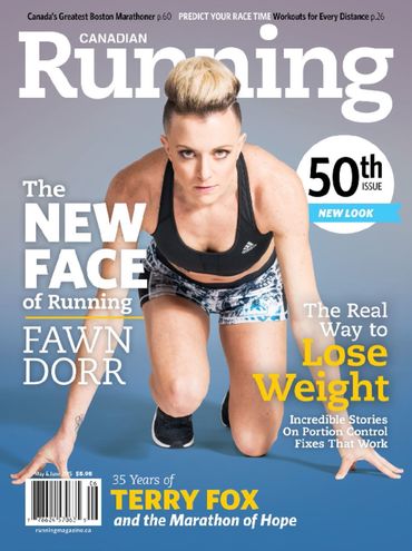
Canadian Running 50th issue unveils subtle, bolder look

For its 50th issue, Canadian Running magazine has unveiled a subtly enhanced new and bolder look -- fewer cover lines, more of a poster presentation --  in its May-June issue. Editor-in-chief is Michael Doyle, art director is Warren Wheeler. (See a comparison with the previous look at Scott Bullock's Covers Sell blog.)

Labels: ,

Tuesday, April 14, 2015

Seneca illustration grads show their stuff
on April 23

Seneca College's independent illustration graduates are presenting their 8th exhibition and showcase on Thursday, April 23. The four-semester diploma within the School of Creative Arts and Animation at Seneca College is unique in the province (although Sheridan College offers a 4-year Bachelor of Arts illustration degree, the only one in Ontario.) 

Seneca's students work in traditional forms such as drawing, painting, mixed media, printmaking and sculpture as well as digital media and learn the business skills to apply their art in the work world. The School of Creative Arts and Animation, part of the Faculty of Communication, Arts and Design, is located at the Seneca@York campus on York University.

The exhibition is an opportunity to see some work by people who will be contributing to Canada's magazine excellence in the years to come. It takes place April 23 to 27 at Artscape Youngplace, 180 Shaw St, Toronto. The opening reception is April 23rd starting at 7:00 p.m. Gallery hours over that weekend are 9 a.m. to 5 p.m. daily.

Labels: , ,

Tuesday, February 17, 2015

Canada's History magazine undergoing a "refreshment" of design and presentation

Feature opening
Canada's History magazine is undergoing a refreshment of its design which will be unveiled with its April-May issue, now at the printers. The magazine will be marking its 95th birthday this year.
While the redesign pretty much leaves the cover architecture and logo alone (so as not to jeopardize the gains the magazine has made on the newsstand), the inside pages and the front and back of the book have been substantially modified by the editorial team, looking to reflect the contemporary relevance of history. 

The visual redesign was handled in house by art director James Gillespie, working with consultant Karen Simpson. The new look includes new fonts and font sizes to improve readability. Editor-in-chief Mark Reid says of it
"Both the front and back of book sections have been streamlined. The Currents section is now more visually dynamic, and some regularly recurring items — such as "Brush Strokes" — have been re-imagined for a modern audience. Our former Reviews Section is now titled Books, and will feature not only book reviews but also interviews with authors, book excerpts and other items of interest to readers. 
Column
"The features section also received a makeover, and now employs a tasteful design that showcases — rather than competes with — the words, pictures and paintings. Layouts are cleaner thanks to the creative use of white space. 
"As many readers know, Canada's History used to be called The Beaver, and we have not forgotten our historic connection to that iconic publication, or the Hudson's Bay Company, which launched the magazine in 1920 as an internal newsletter. In Canada's History you will find many nods to our past; we’ve retained our Trading Post column that showcases fur trade-era artifacts; every feature article ends with a small beaver icon; and we’ve renamed the Letters page “The Packet,” as it was called back in 1920 when the magazine was launched.
Currents opening

Labels: , , ,

Monday, February 02, 2015

Former Toronto Life art director Jessica Rose is moving to Tatler magazine

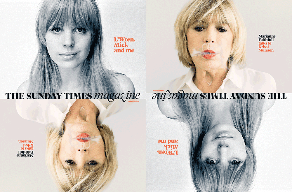
The former art director of Toronto Life, Jessica Rose, has been working for some time at The Sunday Times magazine in London (at right is one of her recent covers.)

Now, she's moving to be the new art director of the high society and fashion magazine Tatler, published by Condé Nast Publications (see below).

She reports that one of the biggest pleasures at the ST was doing a series of front-of-the-book columns with Matt Rudd called the "God of Small Things". There's an archive of them on her website. 

Labels: , ,

Wednesday, July 16, 2014

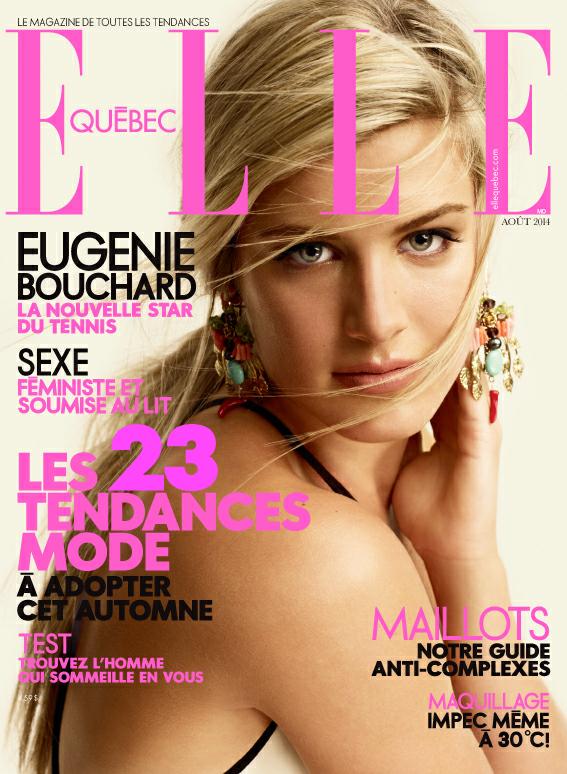
Elle Québec cover shows a sense of perfect timing

Talk about perfect timing; days after she wowed Wimbledon. Eugenie Bouchard on the just-released August cover of Elle Québec.

Labels: ,

Friday, July 04, 2014

Largest golf magazine in the world redesigned to appeal to younger audience. Will it work?

There has been a great reluctance to mess with specialty sports magazines for fear of scaring off the core audience. There seems to have been the assumption that the readers were older, set in their ways and resistant to change. Well, we shall see.

Golf magazines have seemed ossified, stuck in 1962 and featuring a round-robin of topics and cover lines so that readers may bask in the deja vu. Their own kind of handicap, so to speak.

Condé Nast decided to make over Golf Digest, the most widely read golf publication in the world and allowed their design team and Luke Hayman, a partner in the design house Pentagram, to go get them some of those millenial golfers. As the Pentagram site notes 
The format opens up the magazine for a looser, more playful feel that conveys the game’s athleticism and virtuosity, as well as the growing “cool” of golf culture, embodied by player-fans like Justin Timberlake and Jimmy Fallon. For the designers, part of the challenge was finding new methods to visually represent the subject—to break up the monotony of pictures of golf course greens against the bright blue sky, or to show golf tips like swing paths in an unexpected way.
To update the masthead, the designers looked for a font with balls—specifically, ball terminals, which add a playful touch given the subject matter. The contemporary stencil-like font Dala Moa was selected for its distinctive ball terminals, which break free from the letterforms so balls can be hidden in plain sight in the logotype and in display text. With the blessing of Dala Moa’s designer, Paul Barnes, the terminals were customized to make them perfectly round. Commercial Type, the foundry that licenses the font, worked on refining the logotype by adjusting the letter spacing as well as the spacing of the stenciling, to make sure the identity would work in a range of different sizes. The colored dot of the “i” in “Digest” was retained as a link to the magazine’s former logo. 
Inside, the tone is smart, sophisticated, and irreverent, with content designed to engage both golfers and non-golfers. About a quarter of the magazine continues to be instruction––tips and techniques––joined by more articles that contain data and stats about golfers, games and gear, both for pros and amateurs. Shorter articles offer more entry points for the reader, and a flexible grid gives the dense information room to breathe.
Pentagram is well known for its design generally, but its magazine work specifically, ranging from TIME to the New York Times magazine and Atlantic, from Vanity Fair to Billboard

Labels: , , ,

Wednesday, May 28, 2014

Outdoor Canada takes pulp mens' mag action-adventure approach for summer issue

Outdoor Canada's veers from its usual man-holding-critter cover shots with a summer issue (on newsstands June 9) that harkens back to when manly pursuits were celebrated in pulpy action/adventure magazines with over-the-top presentation. Hyperbole was the order of the day and blood curdling illustrations the norm. Kinda fun. The illustrator is Dominic Bugatto 

(Worth noting that the magazine is again shortlisted this year for best magazine in its circulation category in the Canadian Society of Magazine Editors awards which will be announced next week.) 

Labels: ,

Monday, April 07, 2014

Facing the future with the Sheridan graduate illustration show opening April 10

The annual Sheridan Illustration graduate show is on this Thursday, April 10 at 7 p.m. (continuing through Friday 2 - 9) at 99 Sudbury Street, Toronto. "New Faces"is a great place for magazine people to see some of the brightest new talent coming up and into the business. Sheridan College offers the only dedicated Bachelor of Arts Illustration degree program in Canada and the grad show culminates 4 years of study. 

Labels: , ,

Monday, March 17, 2014

Future palettes to influence design and
taste-making

For shelter and lifestyle publishers, editors and art directors out there, Pantone the colour experts have published a series of palettes that contain 72 forecasted colours which they say will inspire and influence home furnishings, design and other aspects of taste-making in 2015. According to a post on Dexigner, Pantone View Home + Interiors 2015 provides colour swatches and images for use in their work. The palettes go by names such as Style-Setting, Abstractions, Botanicum, Zensations, Urban Jungle, Tinted Medley, Past Traces, Serendipity and Spontaneity. (That's Style-Setting up there, ranging from Champagne Beige to Steel Gray; it is said to be all about poise, fitness and polish.)

Labels: , ,

Thursday, March 06, 2014

Maclean's cover story features tough-guy Putin and impotent West

Maclean's magazine is pulling out the tab type for its cover story by Michael Petrou and commentary by columnist Paul Wells about the evolving situation in Ukraine. 

Labels: , , ,

Wednesday, February 19, 2014

The Grid magazine named -- again -- one of five best-designed newspapers in the world

The Grid, the weekly magazine published by Torstar Corp., has been named by the Society for News Design as one of the five best-designed newspapers in the world, for the third year running. (This will doubtless continue to annoy those critics who demand that The Grid choose whether it is a newspaper or a magazine rather than saying it is both.)

The judges said
"If The Grid were a friend — and it seems like it’s aiming to be – it would be the one who grabs this and that from their closet, adds a colorful scarf and a thrift shop bracelet to create a near perfect effect. 
"Pleasingly jumbled at first glance, the whole look is deceivingly harmonious and smart, supported by a design grid that might be 7 columns, 5 columns or somewhere in between, but is always in the neighborhood of hip."

Labels: , ,

Sunday, January 26, 2014

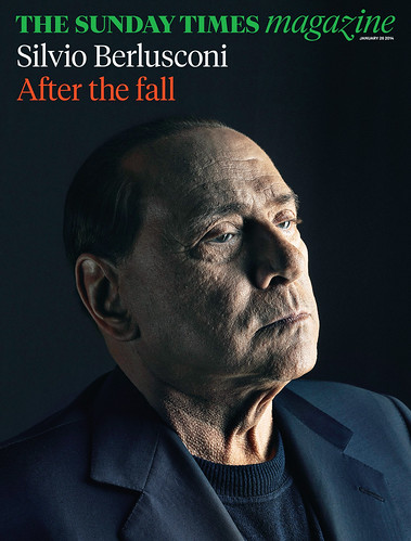
The Sunday Times magazine gets a makeover

"Bigger pictures -- less pictures, longer reads -- less bits."* 
Art director Matt Curtis, describing the complete redesign of The Sunday Times Magazine, the supplement to Britain's Sunday Times. The entire newspaper also received a makeover

 According to a post on Magculture.com, the wholly new look includes the new logo treatment in Tiempos (based on the classic Times New Roman by Stanley Morison) and Calibre, a new sans serif face created by Kris Sowersby. The Sunday Times magazine editor is Sarah Baxter and Jon Jones is director of photography.

Interesting to note that one of the three designers on the redesign team is Jessica Rose, the former art director of Toronto Life


*Minor quibble: Might this have been, correctly, fewer pictures and fewer bits? 

Labels: , ,

Wednesday, September 04, 2013

Western Living unveils redesigned, bumper Designer of the Year issue

Western Living magazine is unveiling a refreshed, new look with its September issue which highlights the winner of its annual Designers of the Year competition. It is the largest issue in more than 20 years. 

The magazine is a lynchpin of western Canadian publishing and the western flagship of its parent company, TC Media, and has a total of 587,000 readers according to the spring 2013 PMB. 

This year, the Designers of the Year event will be held on Thursday, September 12th in Vancouver and on Wednesday, October 2nd in Calgary. It celebrates the best new designs in Western Canada, as judged by Canada's foremost designers and architects. In partnership with IDSwest, the magazine is hosting its first-ever Western Living Design Week, to be held from September 12 to 22. 

It's all but inevitable that when a new art director takes over a visual redesign can't be far behind, though a lot of the structural, editorial changes in the magazine have been driven by editor-in-chief Anicka Quin. Paul Roelofs returned to be the art director of both Western Living and Vancouver magazines last December after a time in the U.S. He had been AD of Western Living from 1988 to 1993 before working on Garden Design magazine and Saveur.He then joined Time Inc.'s launch of InStyle magazine as creative director from 1995 to 2005, during which time he also handled various spinoffs: InStyle Weddings, InStyle Home, InStyle The Look and InStyle Makeover.

Labels: ,

Wednesday, August 28, 2013

Alberta Venture celebrates top 250 companies issue with homage to iconic Fortune cover image

The homage
In a bold and complicated homage to an iconic magazine cover image, Alberta Venture is unveiling its September issue with its annual list of Alberta's 250 biggest companies. The windows of Calgary's Bow building are photographed lit up at dusk to spell out the number 250. It was, said a blog post from the magazine, "a symbol of Alberta’s rise to prominence on the national and international scenes and a poignant reminder of the spirit that allowed this province to recover quickly (for the most part) from the devastating June floods." In this it is giving full credit to the July 1964 cover of Fortune magazine which arranged to light up the windows of New York's Time & Life building (where the magazine was headquartered), a tour-de-force which has been long remembered by magazine mavens everywhere. The idea of the homage came from associate publisher Joyce Byrne and art director Kim Larson.

Unlike the art directors then, today's art directors have Photoshop and could have merely spliced the whole thing together on the desktop, whereas their inspiration had to be achieved by having the huge Time & Life building all dark then arrange to have only those offices lit which spelled out the number 500. In AV's case, the whole building was to be lit up, then windows would be darkened using the software to leave only those lit which spelled out 250. 
The inspiration

Read more »

Labels: , , ,