Tuesday, April 17, 2018

National Geographic launches redesign

National Geographic, the 130-year-old  U.S.-based magazine that everyone seems to think they know, has unveiled a wholly new design, according to a story in Media Post. 
It retains the well-known yellow-margined cover but also several new sections, anchored in the front of the magazine:“Proof,” a section dedicated to short photo essays that bring new perspectives to the magazine’s audience; “Embark,” an investigative section filled with ideas and opinions meant to challenge reader expectations; and “Explore,” which will include a segment called "Atlas," a story told through maps, and an essay about a single, significant photograph called "Through the Lens."
Features are  treated differently, too (this month, the cover feature is about Picasso).
Rather than running four or five stories of the same length and depth of reporting, issues now feature two stories of traditional length and several shorter stories with a focus on illustrations and photos for storytelling effect. A “marquee” package will also continue to be published in each issue. 
The redesign also highlights two new paper stocks, meant to allow the magazine’s photography to appear richer giving the magazine a more substantial feel to its pages, and two new fonts, Earle and Marden, named after National Geographicexplorer-in-residence Sylvia Earle and Luis Marden, a pioneer in the field of color photography.

Labels: ,

Monday, September 25, 2017

Ad Age redesigns, top to bottom

Advertising Age, the U.S. bible of the advertising industry, is undergoing a complete redesign, not only its print edition but also its website. It becomes officially what everyone has called it for years -- Ad Age -- and will have a new look, logo, colour and palate, said a story in the New York Post

The first issue on Monday will have a series of covers, including controversy-plagued NBC anchor Megyn Kelly and a trio of Facebookers including Sheryl Sandberg.

Braiker says the new Ad Age will feature a more contemporary aesthetic and (most crucially) heavier cover stock — a costly investment at time when many mags are reducing frequency. 


Editor Brian Braiker insists there is plenty of money to be made from print pubs — even those with limited focus and niche audiences like Ad Age. Editor Brian Braiker says the redesign will transform the publication from a mere trade to a bona fide cultural must-read.

"This isn't merely a new look," an announcement said. "This isn't window dressing. This is a new Ad Age for a new advertising age. Things are moving faster every day. Which means they'll never be this slow again."

Labels: , ,

Tuesday, August 29, 2017

Revamped AMPA website makes resource library available to the public

The Alberta Magazine Publishers Association (AMPA) recently unveiled a spiffy, redesigned web and mobile site. 
"We wanted to give our visitors a clearer understanding of what AMPA does, a better picture of the state of the industry and more regular updates on what our members are up to. They set high standards so we rose to meet them" the announcement said.
Among the new features, funded in part by the Albera Media Fund, the Department of Canadian Heritage are


Labels: , ,

Wednesday, May 31, 2017

subTerrain magazine shrinks its format to "break out of staid conformity"

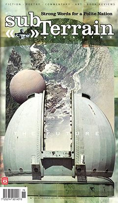
The future is smaller for subTerrain magazine. The Vancouver -based literary has announced it is downsizing its format with its current issue (#76, "The Future Issue") to what it calls a "non-standard off-size" (essentially somewhat like a super-digest.) It has sent a message to subscribers that says, in part
We feel this suits our personality better.  subTerrain started out as a 7 x 10 ’zine and eventually caved in to industry pressure and embraced life as a standard format, newsstand magazine. Well, after nearly three decades of life, we’ve decided to break out of the staid conformity of the magazine rack and live a little. We want to enliven our journey with unpredictability; not only content, but form as well must remain fresh. We are not the New Yorker nor Harper’s, magazines that have maintained their “brand” look for decades and decades on end. We want to embrace the uncertainty of the future; we want to bank on the near limitless possibilities that the unknowable can offer. We don’t want you to know beforehand what to expect from us. We want to surprise you with every issue. We want subTerrain to be an anticipated little piece of mail.

Labels: , ,

Thursday, December 17, 2015

VICE magazine to unveil global redesign for its 21st anniversary in the spring

That was  then...
VICE magazine has announced it will unveil a global redesign in March. Launched as a small punk magazine in Montreal 21 years ago, it has since expanded (ed note: exploded might be a better word) into a multimedia network operating in 20 countries and with a network of alliances and its own cable channel next year.
"So what will change?" asks editor-in-chief Ellis Jones. "While we will continue to collaborate with some of the best writers and artists out there, bringing you the long-form features, ground-breaking photography, and captivating fiction VICE has become known for, we'll use this opportunity to usher in a big increase in cultural coverage as well as new voices and columnists examining sex, finance, and much more. 
"Our digital channels will also become increasingly involved, with space carved out for them to discuss the latest in music, science, technology, women's issues, and more. Finally, we'll overhaul the magazine's overall look and feel."

Labels:

Tuesday, August 25, 2015

Western Living magazine unveiling redesign in a wider format

Western Living magazine has been completely redesigned: taking on a streamlined and refined  new logotype as WL, in a somewhat larger format. Readers will see the new look imminently as part of September's annual Designers of the Year issue. on newsstands and in subscribers mail slots at any moment. Concurrent with the redesign is a revamped website and responsive mobile website design. The inch-wider format gives the design more elbow room for its usual lavish photography and takes advantage of what print does so well. 

Editor-in-chief Anicka Quin, art director Paul Roelofs and publisher Tom Gierasimczuk talk about the redesign in the following video.

Western Living is under new ownership, as part of the Yellow Pages group in BC, along with sibling Vancouver magazine, although doubtless the redesign has been in the works for some time before that.

Labels: , ,

Wednesday, May 13, 2015

Canadian Running 50th issue unveils subtle, bolder look

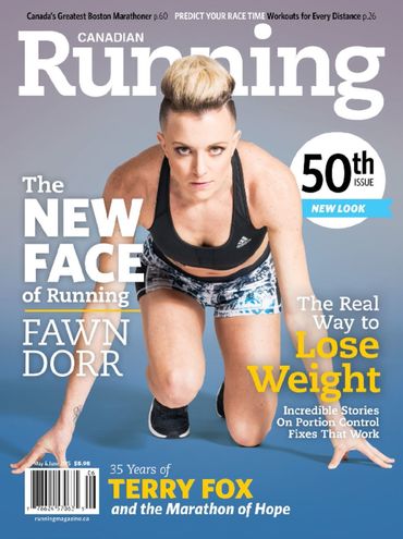
For its 50th issue, Canadian Running magazine has unveiled a subtly enhanced new and bolder look -- fewer cover lines, more of a poster presentation --  in its May-June issue. Editor-in-chief is Michael Doyle, art director is Warren Wheeler. (See a comparison with the previous look at Scott Bullock's Covers Sell blog.)

Labels: ,

Tuesday, February 17, 2015

Canada's History magazine undergoing a "refreshment" of design and presentation

Feature opening
Canada's History magazine is undergoing a refreshment of its design which will be unveiled with its April-May issue, now at the printers. The magazine will be marking its 95th birthday this year.
While the redesign pretty much leaves the cover architecture and logo alone (so as not to jeopardize the gains the magazine has made on the newsstand), the inside pages and the front and back of the book have been substantially modified by the editorial team, looking to reflect the contemporary relevance of history. 

The visual redesign was handled in house by art director James Gillespie, working with consultant Karen Simpson. The new look includes new fonts and font sizes to improve readability. Editor-in-chief Mark Reid says of it
"Both the front and back of book sections have been streamlined. The Currents section is now more visually dynamic, and some regularly recurring items — such as "Brush Strokes" — have been re-imagined for a modern audience. Our former Reviews Section is now titled Books, and will feature not only book reviews but also interviews with authors, book excerpts and other items of interest to readers. 
Column
"The features section also received a makeover, and now employs a tasteful design that showcases — rather than competes with — the words, pictures and paintings. Layouts are cleaner thanks to the creative use of white space. 
"As many readers know, Canada's History used to be called The Beaver, and we have not forgotten our historic connection to that iconic publication, or the Hudson's Bay Company, which launched the magazine in 1920 as an internal newsletter. In Canada's History you will find many nods to our past; we’ve retained our Trading Post column that showcases fur trade-era artifacts; every feature article ends with a small beaver icon; and we’ve renamed the Letters page “The Packet,” as it was called back in 1920 when the magazine was launched.
Currents opening

Labels: , , ,

Thursday, August 28, 2014

Star Media's digital/print beauty and fashion publication The Kit is being expanded and relaunched

The Kit, the beauty and fashion title from Star Media Group is relaunching all of its platforms. Starting in September, the magazine title will have a new website, the digital magazine version will morph into a series of seven beauty guides, there will be a weekly "shoppable" e-newsletter and the weekly newspaper print supplement that is distributed with the Toronto Star, Ottawa Citizen, Montreal Gazette, Calgary Herald, Edmonton Journal and Vancouver Sun will carry more original material. The changes reflect a new strategy designed to tailor content to the habits and interests of its largely women readers.
“Just as the styles we report on are always changing, so are we,” said publisher Giorgina Bigioni. “We’re always trying to stay ahead of what’s next, and it’s important that all of our platforms allow for the best reader experience. For advertisers, unexpected ad placements across multiple platforms, that are both meaningful and engaging, will enable brands to reach and interact with readers.”
The Kit’s digital magazine becomes a series of free, interactive beauty guides, available for download by tablet and mobile phone readers on Apple Newsstands. The first, a fall hair guide, debuts Sept. 15 and includes features on the season’s best ponytails, a hair damage decoder for women of every age and a profile of Grace Mahary, Canadian model and runway darling. It will be followed by a winter skin guide and holiday survival guide. A browser version is available on thekit.ca.    

The Kit publishes French-language digital and paper editions once per month; Le Kit paper is available via Journal Metro in Montreal and Le Kit magazine is available free on Apple Newsstand. The Kit publishes a Chinese-language paper edition once a month, through Sing Tao Daily

The Kit was started in 2010 as an independent digital-only beauty magazine by a team led by Bigioni, formerly the publisher of Fashion magazine (St. Joseph Media). It was acquired by the Star Media Group in 2011 and soon thereafter extended its mandate to encompass fashion and to launch the weekly print edition. 

Labels: ,

Tuesday, July 29, 2014

Mixing a bit more fun with authority, Ski Canada's new look unveiled

Ski Canada magazine is unveiling a whole new look starting with its 2015 Buyer's Guide. The redesign, including a new swooping serif logo, is done by the magazine's designers for the past 8 years, K9 Strategy and Design. 

Partner Jennifer Lourenco says the goal is to strengthen the 42-year-old brand as a current, authoritative voice on all things ski.
"Every redesign is a balancing act between yet-to-be-realised new readers and current loyal readers – you’re constantly asking have we gone too far, or not far enough," she said. "For Ski Canada, we’ve introduced elements that will bring a bit more fun to the reading experience, while still maintaining their role as the leading publication that is synonymous with skiing.”

Labels: ,

Friday, September 20, 2013

Halifax magazine unveils redesign

The new look
To mark its fifth year, Halifax magazine, published by Metro Guide Publishing, has unveiled a dramatic redesign, led by editor Trevor Adams and designer Beth Muzzerall.  The goal has been to provide a cleaner, more urban aesthetic for the 10-time magazine, says Adams in an editor's note.  

[Below, you'll find a video where Adams and Muzzerall discuss the redesign.] 

Along with a stronger and more modern cover flag, there have been considerable additions and changes to the content. 
"Getting excited about a Contents page is kind of a magazine-geek thing to do, but it’s one of my favourite parts of the new design. The page is clean, reader-focused and makes bold use of photography—it embodies everything we’re trying to do with the new look," says Adams.
The old look
The new design even allows more words on a page even though pictures are stronger and text flows naturally. Among the new features is a back-page column by Jack Florek, "an American expatriate who moved his family from New Jersey to Halifax, after a lifetime of yearning to be Canadian."

Concurrently, the magazine's website has been refreshed and made responsive so that it will display on any device.  To celebrate the launch, the magazine has a scavenger hunt promotion. The letter "H" is hidden in various ads; readers who send in pictures of these spots are eligible to win a weekend a weekend for two at the Delta Halifax, dinner and tickets to the Neptune Theatre's production of A Christmas Carol in November. 

Labels:

Tuesday, July 23, 2013

Design Edge Canada magazine now owned and operated by C.J. Oyster Publishing

Design Edge Canada magazine has been sold to the C.J. Group of Companies  and its  C.J. Oyster Publishing Inc. division in Toronto. 
The magazine was started in 2006 by North Island Publishing Limited of Mississauga, which also publishes the online magazine Masthead. According to a post on the magazine's website, the takeover brings with it the revival of the Canadian Regional Design Awards, which North Island had started but which were in hiatus.
"The paperwork was completed in May and the transition has been gradual, but as of last week The C.J. Group of Companies in Toronto is proud to announce we have completed taking over of the Design Edge Canada media brand, including Design Edge Canada magazine, designedgecanada.com as well as the Canadian Regional Design Awards (a.k.a. “the Redgees").... 
"We are very excited about taking on this publication and its affiliated properties,” says Jay Mandarino, founder and CEO of The C.J. Group of Companies. “It’s important to us that this publication flourishes and continues its mandate to inform and inspire graphic designers, art directors, creative directors and all other professionals associated with design in its many forms across Canada.”
Leslie Smith will be the publisher, replacing Doug Bennet, the founding publisher. She said that the redesigned magazine will be unveiled in September and the  hope was to revive the Design Awards in early 2014.

Labels: , ,